Building with Block Kit
The Block Kit UI framework is built with blocks, block elements and composition objects.
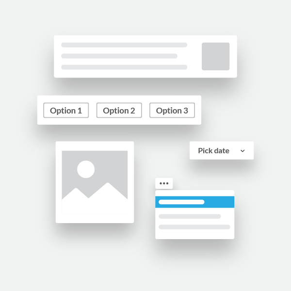
Blocks are visual components that can be arranged to create app layouts. Apps can add blocks to surfaces like the Home tab, messages and modals.
Blocks may also contain block elements. Block elements are usually interactive components, such as buttons and menus.
Blocks and block elements are built with composition objects. Composition objects define text, options, or other interactive features within certain blocks and block elements.
Whether you're composing layouts for modals, messages, or tabs, the Block Kit building experience is the same — your app will be sculpting specially-structured JSON to express itself. The result is clear, interactive communication between your app and its users.
Eager to see Block Kit in action? Take a peek in Block Kit Builder.
.%20Try%20it%20out%20by%20using%20the%20%60%2Ftask%60%20command%20in%20this%20channel.%22%7D%7D%2C%7B%22type%22%3A%22section%22%2C%22text%22%3A%7B%22type%22%3A%22mrkdwn%22%2C%22text%22%3A%22*2%EF%B8%8F%E2%83%A3%20Use%20the%20_Create%20a%20Task_%20action.*%20If%20you%20want%20to%20create%20a%20task%20from%20a%20message%2C%20select%20%60Create%20a%20Task%60%20in%20a%20message%27s%20context%20menu.%20Try%20it%20out%20by%20selecting%20the%20_Create%20a%20Task_%20action%20for%20this%20message%20(shown%20below).%22%7D%7D%2C%7B%22type%22%3A%22image%22%2C%22title%22%3A%7B%22type%22%3A%22plain_text%22%2C%22text%22%3A%22image1%22%2C%22emoji%22%3Atrue%7D%2C%22image_url%22%3A%22https%3A%2F%2Fapi.slack.com%2Fimg%2Fblocks%2Fbkb_template_images%2FonboardingComplex.jpg%22%2C%22alt_text%22%3A%22image1%22%7D%2C%7B%22type%22%3A%22section%22%2C%22text%22%3A%7B%22type%22%3A%22mrkdwn%22%2C%22text%22%3A%22%E2%9E%95%20To%20start%20tracking%20your%20team%27s%20tasks%2C%20*add%20me%20to%20a%20channel*%20and%20I%27ll%20introduce%20myself.%20I%27m%20usually%20added%20to%20a%20team%20or%20project%20channel.%20Type%20%60%2Finvite%20%40TaskBot%60%20from%20the%20channel%20or%20pick%20a%20channel%20on%20the%20right.%22%7D%2C%22accessory%22%3A%7B%22type%22%3A%22conversations_select%22%2C%22placeholder%22%3A%7B%22type%22%3A%22plain_text%22%2C%22text%22%3A%22Select%20a%20channel...%22%2C%22emoji%22%3Atrue%7D%7D%7D%2C%7B%22type%22%3A%22divider%22%7D%2C%7B%22type%22%3A%22context%22%2C%22elements%22%3A%5B%7B%22type%22%3A%22mrkdwn%22%2C%22text%22%3A%22%F0%9F%91%80%20View%20all%20tasks%20with%20%60%2Ftask%20list%60%5Cn%E2%9D%93Get%20help%20at%20any%20time%20with%20%60%2Ftask%20help%60%20or%20type%20*help*%20in%20a%20DM%20with%20me%22%7D%5D%7D%5D)
Read on to learn how you can construct the stacks of blocks that app surfaces love to consume.
Placing blocks within surfaces
Blocks are used within all app surfaces: Home tabs, messages and modals can all be designed using blocks.
Each of them uses a blocks array that you prepare by stacking individual blocks together.
Check out app surfaces to learn more about using these different surfaces, and how to add blocks to your app's Home tab, messages, and modals.
Building blocks
There's no special setup needed to start using blocks in app surfaces. However, just as when you open a pack of generic, colorful, interlocking plastic bricks, you should read the instructions first.
Defining a single block
Each block is represented in our APIs as a JSON object. Here's an example of a section block:
{
  "type": "section",
  "text": {
    "type": "mrkdwn",
    "text": "New Paid Time Off request from <example.com|Fred Enriquez>\n\n<https://example.com|View request>"
  }
}
Every block contains a type field — specifying which of the available blocks to use — along with other fields that describe the content of the block.
Block Kit Builder is a visual prototyping sandbox that will let you choose from, configure, and preview all the available blocks.
If you want to skip the builder, the block reference guide contains the specifications of every block, and the JSON fields required for each of them.
Stacking multiple blocks
Individual blocks can be stacked together to create complex visual layouts.
When you've chosen each of the blocks you want in your layout, place each of them in an array, in visual order, like this:
[
  {
    "type": "header",
    "text": {
      "type": "plain_text",
      "text": "New request"
      }
  },
  {
    "type": "section",
    "fields": [
      {
        "type": "mrkdwn",
        "text": "*Type:*\nPaid Time Off"
      },
      {
        "type": "mrkdwn",
        "text": "*Created by:*\n<example.com|Fred Enriquez>"
      }
    ]
  },
  {
    "type": "section",
    "fields": [
      {
        "type": "mrkdwn",
        "text": "*When:*\nAug 10 - Aug 13"
      }
    ]
  },
  {
    "type": "section",
    "text": {
      "type": "mrkdwn",
      "text": "<https://example.com|View request>"
    }
  }
]
Block Kit Builder will allow you to drag, drop, and rearrange blocks to design and preview Block Kit layouts.
Alternatively you can use the block reference guide to manually generate a complete blocks array, like the one shown above.
Your newly created array of blocks can be used with a range of different app surfaces.
Accessibility considerations
When posting messages, it is expected behavior that screen readers will default to the top-level text field of the post, and will not read the content of any interior blocks in the underlying structure of the message. Therefore, to make an accessible app, you must either:
- include all necessary content for screen reader users in the top-level
textfield of your message, or - do not include a top-level
textfield if the message hasblocks, and allow Slack attempt to build it for you by appending content from supportedblocksto be read by the screen reader.
Adding interactivity to blocks with block elements
Blocks can be made to interact with users via Block Kit elements. Elements include interactive components such as buttons, menus and text inputs.
Here's an example of a button element within a section block.
{
	"blocks": [
		{
			"type": "section",
			"text": {
				"type": "mrkdwn",
				"text": "This is a section block with a button."
			},
			"accessory": {
				"type": "button",
				"text": {
					"type": "plain_text",
					"text": "Click Me",
					"emoji": true
				},
				"value": "click_me_123",
				"action_id": "button-action"
			}
		}
	]
}
When you add an interactive component to a surface in your Slack app, you've opened the door to user interaction. People will push your app's buttons and expecting a helpful and prompt reaction.
Apps need to handle the requests that start to flow their way, and respond appropriately. Follow our guide to handling user interaction to prepare your app for the interactivity that Block Kit will inspire.
Block Kit builder allows you to add elements to blocks as well. Give it a try! Alternatively, read the Block Kit element reference guide for all the info you'll need for manually implementing individual elements.
Onward
Check out the following guides for everything blocks: