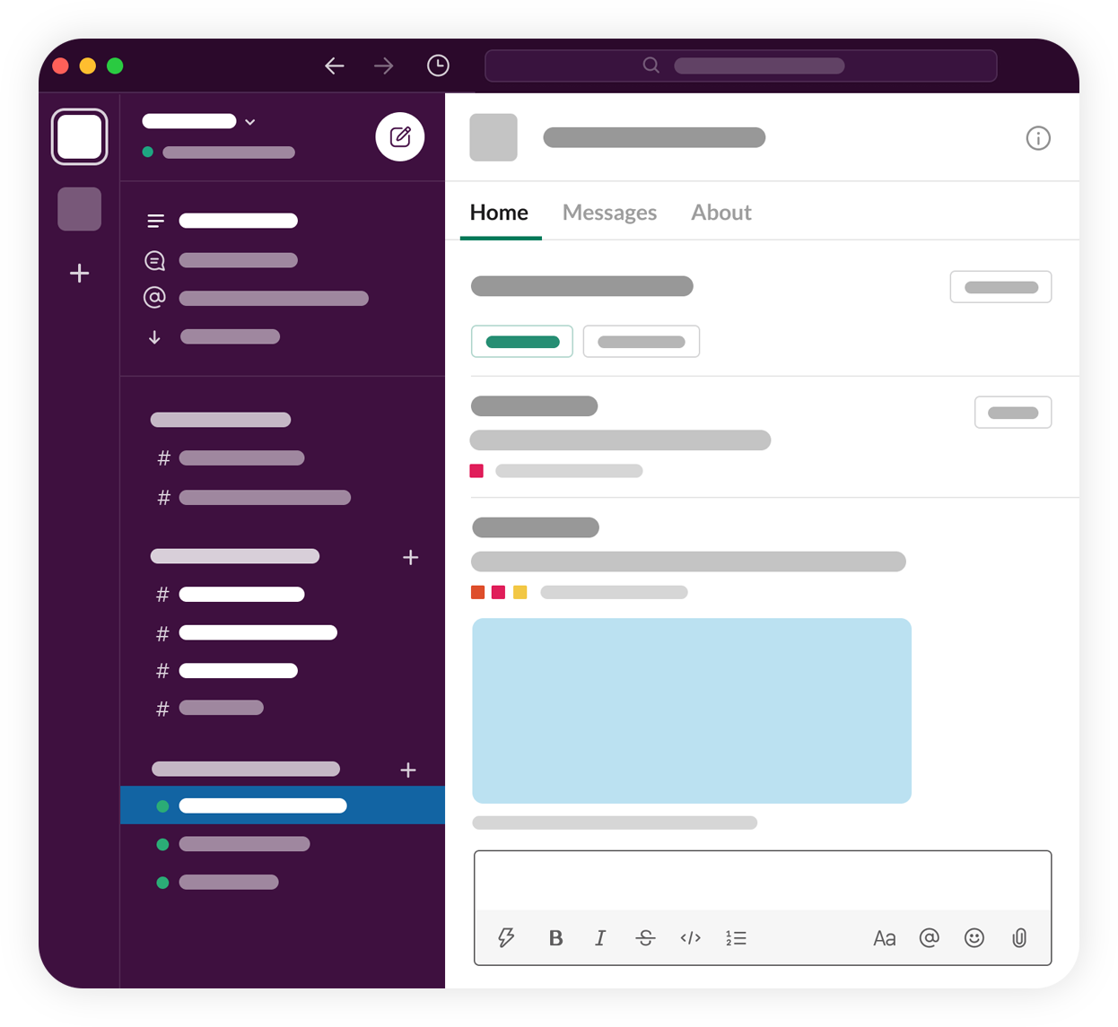
App Home
The App Home is a private, one-to-one space in Slack shared by a user and an app. It is only available in Slack apps, not Workflow automations.
Each App Home can contain three tabbed views:
- The Home tab — a fully customizable space enriched with Block Kit layouts and interactivity.
- The Messages tab — the app-user conversation, taking advantage of all the typical Slack messaging features.
- The About tab — the descriptive info about the app.
This guide details how to utilize all three tabs of App Home. Jump to whichever tab you want to focus on, or read through everything App Home.
Regardless, you'll need a Slack app before you can begin. If you don't already have one, click the button below:
Using the Home tab
An app's Home tab can be published and updated at the app's whim. You can publish a single table design to all the app's users, or provide personalized dynamic tabs that updates upon interaction.
This combination of a fixed location for a persistent interface with dynamic contents enables a huge range of use cases for Slack apps.
Some ways you can make use of the Home tab:
- Onboard users to your app
- Display dashboards and other personalized user data
- Surface app settings
- Authenticate users to 3rd party apps
- Alert users of app updates
As you design your Home tab, consider the following:
-
Present users information that is most relevant for them.
For example, if you’re building a ticketing app, users will likely want to see open tickets assigned to them. Think about how to organize information for users in a customized, accessible way.
-
The most important content should shine at the top of your Home tab.
This includes entry points to invoke your app’s core functionality alongside useful information that users will want to access most often. Employ the use content dividers when considering what actions and information is important to the user, versus what could be expressed as secondary, or hidden behind a modal.
-
Show app settings
A good rule of thumb is to present app settings in your Home tab behind a button. Settings are specific to your app, and different users may have specialized settings — for example, admins may be able to control workspace-wide settings whereas standard users should not have access to this.
Block Kit Builder's calendar template is an exceptional example of exposing settings in your app's Home tab.
-
Curate call-to-actions
To avoid bombarding a user with too many call-to-actions, consider limiting the amount of actions a user can take in your Home tab. If actions are essential to your app’s experience, look into overflow menus to help hide the less-essential actions and focus on what the majority of your users will want to accomplish within your Home tab. This section will take you through the steps necessary to publish and update an app's Home tab for a user at any time.
1. Preparing your app to use Home tab
To start using your app's Home tab, you'll need to set up a few things in app management.
Request necessary permissions
Your app needs at least one permission scope to enable the Home tab. It doesn't matter which scope, but if you want your app to also use the Messages tab you'll need to add the chat:write anyway.
To add a scope:
- Go to your app settings.
- Click OAuth & Permissions in the sidebar.
- Select a scope under Bot token scopes.
Enable Home tab
With a scope added, you can now enable the Home tab.
To enable the Home tab:
- Go to your app settings.
- Click on App Home in the sidebar.
- Under Show Tab, switch on the Home tab toggle.
This page is also where you can choose to disable the Messages tab, if you wish.
Subscribe to the app_home_opened event
- Go to your app settings
- Click on Event Subscriptions in the sidebar.
- Under Subscribe to bot events, click Add Bot User Event. Search for and select
app_home_opened, then save your changes.
Subscribing to the app_home_opened event will notify you when a user clicks into your App Home.
Install your app
Now you'll need to install your app. For single workspace apps:
- Click on Install App in the sidebar.
- Click Install to Workspace. If you have previously installed it, click Reinstall to Workspace.
- Click Allow to grant the app access to your workspace.
Once your app is installed, grab the Bot User OAuth Access Token. You can find it on the OAuth & Permissions page. You'll need to use it later.
Your app's Home tab will now appear within your App Home, but it will be empty. Let's change that.
2. Composing a view
The Home tab is composed of a single view that can contain up to 100 blocks.
That view object is a JSON object that contains a blocks array that defines the layout composition, alongside other fields.
Home tab view object fields
| Field | Type | Description |
|---|---|---|
type |
String | Required. The type of view. Set to home for Home tabs. |
blocks |
Array | Required. An array of blocks that defines the content of the view. Max of 100 blocks. |
private_metadata |
String | An optional string that will be sent to your app in view_submission and block_actions events. Max length of 3000 characters. |
callback_id |
String | An identifier to recognize interactions and submissions of this particular view. Don't use this to store sensitive information (use private_metadata instead). Max length of 255 characters. |
external_id |
String | A custom identifier that must be unique for all views on a per-team basis. |
If you use non-standard characters (including characters with diacritics), please be aware that these are converted and sent in unicode format when you receive the view callback payloads.
In our example below, we're creating a view containing text and an image.
{
  "type": "home",
  "blocks": [
    {
      "type": "section",
      "text": {
        "type": "mrkdwn",
        "text": "This is a Block Kit example"
      },
      "accessory": {
        "type": "image",
        "image_url": "https://api.slack.com/img/blocks/bkb_template_images/notifications.png",
        "alt_text": "calendar thumbnail"
      }
    }
  ]
}
3. Publishing a view to your Home tab
After desiging the view object, use the views.publish method to publish the content to the Home tab.
There are three required arguments. Here's how to use them for our example:
token- This is the bot token we asked you to make note of earlier.user_id- For this example, this is your user ID. You can find this within Slack by opening your profile, clicking on the ":" button and choosing "Copy member ID". Beyond this example, apps can get a user's ID programmatically by subscribing to theapp_home_openedevent, from interaction payloads or from the many other places you can encounter auser_id.views- This is the view object JSON object created in the previous step.
Now make the call to views.publish with the above values:
POST https://slack.com/api/views.publish
Content-type: application/json
Authorization: Bearer YOUR_TOKEN_HERE
{
  "user_id": "YOUR_USER_ID",
  "view": {
    "type": "home",
    "blocks": [
      {
        "type": "section",
        "text": {
          "type": "mrkdwn",
          "text": "This is a Block Kit example"
        },
        "accessory": {
          "type": "image",
          "image_url": "https://api.slack.com/img/blocks/bkb_template_images/notifications.png",
          "alt_text": "calendar thumbnail"
        }
      }
    ]
  }
}
If your API call was a success, you'll get a success response containing ok: true.
Navigate to your App Home within Slack, click on the Home tab, and you'll see your newly created layout.
4. Updating your Home tab
Updating a Home tab also uses the views.publish method. Providing a new blocks array will update the view accordingly.
In this example, we've added a new block element: a button. A button is a Block Kit interactive component.
POST https://slack.com/api/views.publish
Content-type: application/json
Authorization: Bearer YOUR_TOKEN_HERE
{
  "user_id": "YOUR_USER_ID",
  "view": {
    "type": "home",
    "blocks": [
      {
        "type": "section",
        "text": {
          "type": "mrkdwn",
          "text": "This is a Block Kit example"
        },
        "accessory": {
          "type": "image",
          "image_url": "https://api.slack.com/img/blocks/bkb_template_images/notifications.png",
          "alt_text": "calendar thumbnail"
        }
      },
      {
        "type": "actions",
        "elements": [
          {
            "type": "button",
            "text": {
              "type": "plain_text",
              "text": "Click Me",
              "emoji": true
            },
            "value": "click_me_123",
            "action_id": "actionId-0"
          }
        ]
      }
    ]
  }
}
Make this API call, and your Home tab will update automatically to reflect the new content.
In a real world context, apps will likely need to store the user_id of the Home tab user, along with any relevant customizations for individual users. This is because Home tab updates can happen when a user isn't interacting with Slack or the app — for example if a Home tab update was triggered by an external service.
Next steps: adding interactivity
If you try clicking on the button in the created example Home tab, you'll see that they don't do anything other than display an error icon. That's because even though you can publish Block Kit interactive components without enabling interactivity, users won't be able to use them. See the user interactivity guide for instructions.
Take a deeper dive into Block Kit and find out about the full range of blocks and block elements available to use in Home tabs.
You can also browse onboarding templates in Block Kit Builder.
Using the Messages tab
The Messages tab in an App Home provides a space for the app and user to converse.
Request necessary permissions
Your app needs the chat:write permission scope to use the Messages tab, and the im:history scope to respond to messages.
To add the scope:
- Go to your app settings.
- Click OAuth & Permissions in the sidebar.
- Select a scope under Bot token scopes.
- Add chat:write.
- Add im.history (Optional).
Enable Messages tab
Then you can enable the Messages tab. To do so:
- Go to your app settings.
- Click on App Home in the sidebar.
- Under Show Tab, switch on the Messages tab toggle.
Subscribe to message.im events
Your app must also subscribe to the message.im event so it can respond to messages.
To do so:
- Go to your app settings.
- Click on Event Subscriptions.
- Make sure Enable Events is toggled on.
- Under Subscribe to bot events, click Add Bot User Event.
- Add message.im.
- Click Save Changes.
You'll then receive an Events API notification for every message sent to your app via the Messages tab.
Your app can then choose to respond to those messages in whatever way you see fit. Some ideas:
- The
userandchannelIDs found in theapp_home_openedevent can be used as thechannelparameter when calling thechat.postMessagemethod to publish a message. - An incoming webhook can be created for the Messages tab conversation.
- Message responses can be created when a valid
request_urlis received.
Next steps: customizing messages
Read our guides to messaging for Slack apps for more details on how to enrich your app's messages with rich layouts and interactivity.
Using the About tab
The About tab displays basic information about your app. Here, users can view:
- The app name
- The app icon
- A short description about the app
- And a few other specific details about the app
To tweak the About tab for your app:
- Go to your app settings.
- Click Basic Information in the sidebar.
- Go to Display Information.
- Make any desired changes.
- Click Save Changes.
Detecting App Home visitors
The app_home_opened event is accurately named — it tells your app when the user has opened the App Home. Your app can listen for this event and respond accordingly.
A payload will be delivered to your app via the Events API, containing actionable and contextual information about the event. This information will include the user that opened the App Home, the workspace that the event happened in, and more. Here's an example:
{
    "type": "app_home_opened",
    "user": "U123ABC456",
    "channel": "D123ABC456",
    "event_ts": "1515449522000016",
    "tab": "home",
    "view": {
        ...
    }
}
Your app can use this contextual information in its response to the user.
For example, the event_ts field is a timestamp dated that identifies within a few seconds when the user opened the window. Your app might store this, along with the user and channel IDs, so you can keep track of when, if ever, your app last interacted with a user in your App Home.
If you need more information about the user and have the appropriate scopes, use users.info. If you need more information about the conversation that forms the App Home Messages tab, use conversations.info.
Responding to an App Home visit
A user opening your App Home represents clear intent or interest in your app. There are many options for responding to such an event. Here are some examples:
-
Onboarding new users. Use the event to trigger a helpful and informative onboarding flow. Read Rolling out the Red Carpet and learn about building great onboarding experiences on Slack.
-
Boost user familiarity with regular tips. Display them to a user at varying cadences when they open the App Home. Give users control of how often these reminders come.
-
Re-engage visitors. If a user hasn't interacted with your app in a while, and you receive a
app_home_openedevent, send them a message that welcomes them back and shows actionable next steps. -
Provide updates on your app. Keep your users informed of the latest app improvements, new functionality or features released. But don't just market to them.
-
Prompt for configuration. Messages and Home tabs are buses for all kinds of interactivity — help users configure your app in a safe place, away from public channels.
Deep linking to App Home
You can use a special deep-linking syntax to directly navigate users to different parts of Slack. This syntax can create links to open conversations, share files, and can even link a user right into your App Home:
slack://app?team={TEAM_ID}&id={APP_ID}
The link opens the App Home belonging to the app specified by the APP_ID in the id field, like A123ABC456. You should specify team with a TEAM_ID, using the ID of your Slack workspace.
You can also deep-link directly to a specific tab within an App Home:
slack://app?team={TEAM_ID}&id={APP_ID}&tab=home
The value of tab should be one of:
home- opens the Home tab of the app specified byidwithin the Slack workspace specified byteam.about- opens the About tab of the app specified byidwithin the Slack workspace specified byteam.messages- opens the Messages tab of the app specified byidwithin the Slack workspace specified byteam.
Onward: pairing with modals
Modals are a type of app surface ideal for requesting and collecting data from users. Interactive components within Home tabs can trigger modals, allowing apps to take input in a more focused space and respond accordingly. See Modals for instruction.